Thursday 28 May 2009

PPD photography


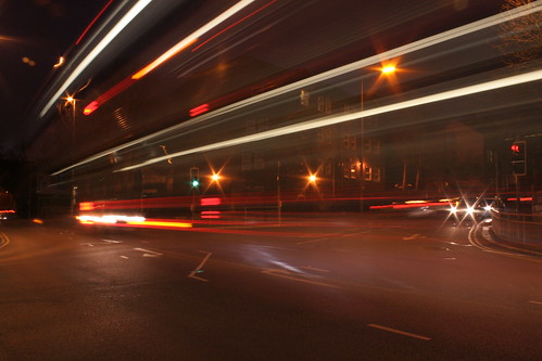
For the first crit for the presentations and just a sample of photographs I might use for the presentation. I think as a narrative I want to focus on limitations, how they have effected my work and ultimately benefited my work.

Wednesday 1 April 2009

OUGD104 evaluation

What skills have you developed through this module and how effectively do you think you have applied them?

Exploration of techniques has been good throughout this module, this being visual language, its been good to truly experiment with my camera again, and create some interesting effects i didn't know I could do. Refreshing my mind with controlling the camera from the photography sessions has really helped to improve my skills and use my camera to its full potential.

What approaches to/methods of research have you developed and how have they informed your design development process?

My secondary research has been much better with this particular module, having the ability to just explore books and the internet for artists and designers. Since the beginning of the course I have bookmarked particular artists and designers for future reference and its really paid off with this research. The crits also have helped, recommending different pieces of work to explore and taking direction influence.

What strengths can you identity in your work and how have/will you capitalise on these?

Being a little more fluid with the development work, not really sure how pieces were going to work but just trying. I need to be more like this for other briefs. the research aspect has been really strong, my workload on the blog has grown dramatically and has been really useful to post internet research quickly and easily. Also my photography work, using my camera properly again for this first time in a while and creating some good effects.

What weaknesses can you identify in your work and how will you address these more fully?

The individual sessions with different techniques were the fall for me, not completing work to the standard I want and Missing one or two sessions really messed things up and my work has suffered. This work should of been completed on the day stated and I would have produced much better work. Its a shame really because the sessions themselves were really interesting and have benefited work since. For future briefs and modules I will address this and won't let it happen.

Identify five things that you will do differently next time and what do you expect to gain from doing these?

Address work for single sessions immediately, to not let them slip.

look after work personally. Photography studio work because members of the group who took responsibility lost documents.

Experiment more! Make better use of the time.

How would you grade yourself on the following areas: 
(please indicate using an ‘x’) 

5= excellent, 4 = very good, 3 = good, 2 = average, 1 = poor


Attendance 4

Punctuality 4

Motivation 4

Commitment 3

Quantity of work produced 3

Quality of work produced 4

Contribution to the group 3

Tuesday 24 March 2009

'A' Breakthrough

'A' breakthrough
I originally began experimenting with the use of colour with the rockwell typeface to give my font a little more depth, however this didnt seem successful. By chance, I layered two different colours of 'organic' movement type in different colours to create a much better effect. After choosing the correct layer mode this is what I came up with. Combining a range of colours. Isn't it lovely?

Lighabet


Lighabet
Originally uploaded by Luke Hallam Photography

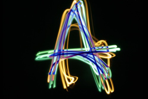
First final idea for a typeface overlaying a rockwell font. I chose it because of strong serifs and clear define of each edge to trace. Im happy with how it came out although the exploration of colour and a more organic movement was prefered in the crit, so I will continue with that and experiment.

Tuesday 10 March 2009

Shine a light

I invested in a few different light sources and combined with some filter samples I have to create some coloured lights. I especially like the letterforms in this sample and probably what I will continue in the line brief.

IMG_6749

Pro Flickr

My account has been upgraded, now expect many more photographs on there. I hope this'll encourage me to take more photos.. especially because I'm paying for it. :)

IMG_0600

Glow sticks.

IMG_6716
Little bit more experimentation with light and line, here with glow sticks. Again click to see a few more images, but strangely coming to the end of my monthly flickr limit.. yet only uploading 25 or so images.. rubbish!

Traffic.

IMG_6692
Photos experimenting with traffic lines and trails. Just as a starting point and another possible direction. Click the image for more photos.. hopefully.

BOOOOOOOM light drawings

Light drawings created by Cenci Goepel and Jens Warnecke from booooooom.com Just more examples of experimenting with line.


Friday 13 February 2009

OUGD102 Self Evaluation

What practical skills have you developed through this module and how effectively do you think you have applied them?

I think my skills with Illustrator and Indesign have moved on much more, the work has almost forced me to use the software and experiment and develop ideas with the tools such as the pen tool, and adjusting the weights of stroke and fill. It was a breath of fresh air to actually be shown Indesign properly and be able to create a book with ease, ordering pages as appose to attempting to teach yourself in your ND course for an FMP, mentioning no useless tutors names (Chris Coldbeck) 

What approaches to/methods of problem solving have you developed and how have they informed your design development process?

The blog on this particular module has been really useful, a great place to get feedback from work, put down your ideas and show a clear path of where you need to take your ideas and processes. The what if? brief was my favourite of this module and problem solving in a group was not only useful but really enjoyable to do, to be able to devise a solution from a problem has been useful.

What strengths can you identify in your work and how have/will you capitalise on these?

The strengths have been through the use of a computer from the research, development through software and documenting on my blog from crits and progress. It doesn't feel like a chore anymore to update the blog, I'm now quite happy to ramble on individual posts about my work.

What weaknesses can you identify in your work and how will you address these more fully?

Time management has again been an issue, working on weekly briefs was intense in the first module, but I eventually got used to it and I worked alright, but with the book brief spanning 5 weeks, I had a tendency (and I think a few people did) to relax for the beginning of the brief a little then have to work much harder towards the end of the brief. If I had worked at the same pace throughout, I would of definitely produced more work. 

Identify five things that you will do differently next time and what do you expect to gain from doing these?

1. More primary research
2. Be consistant with work amounts
3. Timetable days more, have a fixed list of things to do that day, organised from the start!
4. Use the studio more, i did in the first module, but slipped a little with going home earlier.. I do work better at Uni.
5. Don't be so focused with ideas in development, I keep doing it!

Are there any things we could have done differently that would have benefitted your progress?

The same as the list of 5 really, and get organised. Use time for effectively.

How would you grade yourself on the following areas:
(5=excellent, 1=poor)

Attendance: 4
Punctuality: 4
Motivation: 3
Commitment: 3
Quantity of work produced: 3 (I'm not happy)
Quality of work produced: 3
Contribution to the group: 4

Ps + Ai + Id = A6

The book from the Ps brief we had to show the design process, If Im honest I didn't really know what to do for this, what to include so I basically showed the design process for a previous brief. Working from the initial 100 photographs collected onto the what if? brief finals.. showing the process and design decisions on how it lead to a smile campaign. Even though it is stupidly simple, I do really like it. I haven't really got used to simple in my work, I always think it needs more. For this Im relying on the images to explain the process. I think it does.


Thursday 12 February 2009

100 brief, final crit.

You can take feedback in loads of different ways, wherethe its just opinions or if its actually constructive. Had my feedback earlier today for the carton book contraption and i got some really useful feedback. David Gasi and Boysie Sands gave me my feedback which I'm really happy with, feedback I can use and work from. Anyway! what they said..

'large quantity of focused secondary research, extensive collection of exciting bottles/cans/branding. Good collection of health affect related material. Fair amount of primary research, could use some more.'

'Good evidence of development process, focused but maybe more variations could be helpful. i.e. more visual exploration of book in container concept'

I agree with what's been said here, I think when creating the container, and the short brain storm, one on level I thought that a carton (because of its shape and capacity) was the only way to go under the time frame. Maybe research more into different concepts, even if it was a few pages to atleast show the experimentation. I think I'm going to add some drawings towards the back or my book to show I have now considered this.

'Understand the design process, shows progression, develop container box, show contextual understanding, but maybe fruit juice is under represented for resolution, but with soft-drink content.'

Again highlighting the previous point with the relation of the softdrink content and the fruit juice carton, although some facts do relate, its not as strong so ill look into other packaging as ideas.

Good exploration, physical, but very direct to resolution. More conceptual work required, but is evident in design sheet. More design sheets?'

True, for my final net I did only trace the net dimensions and recreate it, wherethe I could of changed the dimensions so it was more of a book shape? more page layouts?

'Good effort! Expand variations, concepts, its very focused again.'

This point covers my views of the project. Its become too focused again which I have a tendency of doing with my work, as soon as I get an idea, just jump onto it, which is wrong! I need to experiment more. I really want to do well next module.

Wednesday 11 February 2009

The book.

Ive lost count of how many practice prints Ive done, so I went ahead with the settings on my printer all sorted, the stock sat perfectly in the printer and what I thought was everything sorted, printed fine, until I came to trim..


Vertical alignment was perfect throughout but the horizontal wasn't in a few places, I think this is the worst example in the entire book, where you can see around 4mm of the wrong page in the gutter. Not a happy bunny. To be off by a weird amount, I dont think it was down to the documents themselves, they were laid out properly, I think it may of been down to the paper feed on the printer. As this wasnt a duplex printer, it doesn't know the the paper will need to be reloaded into the printer. I think it was just pot luck and unfortunately it hasn't worked a couple of times.

Some pages came out perfect which I'm really happy about, it looks quite tidy.

Some pages Ive got away with just but still not to the standard I wanted.

The additional folds look quite good, and alignment hasn't been too much of an issue with these (the pages were 85 mm wide instead of the book pages which were 95 mm) 

The book bound with staples, (which wasn't a problem), I thought staples would look untidy but it doesn't I quite like it. For the final hand-in i will have this book, layouts of each page spread, and a net layout of the outer packaging. With problems with printing on a large scale only until recent. I think i will print the net at full size eventually, for personal reasons.

Tuesday 10 February 2009

Carton Development.

Some of the images aren't in the exact order, but you can tell the flow where things have been refined. Feedback from my mini crit will be posted shortly.


What is a line? statement.

Currently leaning towards light and tape, I feel my research is strong in both aspects so i wish to continue further with both parallel until I come to a decision. My light line work is just a white light at the moment creating organic shapes whereas I want to continue more with different colours, creating shapes, and other sources of light, maybe sparklers, household lights, and existing light within an environment. I want to keep the light work very visual, whereas I think the tape work should be documenting something. Im thinking journeys at the moment, recording paths with lines and the cross overs and divides they have. Start small with around the house, then maybe something on a larger scale? only time will tell.

Friday 6 February 2009

Final Crit.


Just had my final crit this afternoon for the book project. Couple of points highlighted from the feedback of what I need to address in the coming week before I hand in the book. A title/strapline needs to be defined to show the reason and draw people into the book.. Im currently working on 'whats inside? - revealing the truth of what is in your favourite softdrinks'

Is the type choice working? I can see where they are coming from with the choice. I think the size doesn't justify it, I feel filling the page is required and maybe smaller text laid out would work much more successful. These crits are useful to see where you might be going wrong and not notice something you've been staring at for weeks.

Visual variations? Again i see the point of why they said, but I want to keep something corporate with the whole interior and exterior, maybe adjustments with the layout is all thats needed? ill investigate and have a mock done for monday to showw.

Borrow drinks packaging? I thought they would say this, I know what they mean like the 'shelf life' book which adopts a packaging exterior but I want something a little more subtle for packaging, but would still be packaging, say innocent or dorset cereals.. just come to mind. I dont want a real tack looking exterior then a subtle interior. Ok rant over, I shall develop and return. 

Wednesday 4 February 2009

Thank you Becca.

More findings from you lovely people on the subject of what is a line.. Becca suggested 'Eric Staller' to me, who draws with light, and does it really well. Enough chit chat, here it is.. The same images of what Becca has chosen but, I still want to show these.


It always amazes me on how these images are created with what looks like no help from anything else, and the fact it isnt photoshop work or computer generated.. This is definitely getting me excited about the what is a line project and continue with more light work..

If you want more graphic design awesomeness, look at Rebecca Liggins' blog here. Dooo it.

It came!

I ordered what seems like an age ago, the shelf life from amazon.. and it came! :)


Its the kind of book you'll only look though a couple of times and occasionally tell people about but it is really good. Funny products in different categories, and really my original layout for my book. Simple image and a little piece of information.