Tuesday 24 March 2009

'A' Breakthrough

'A' breakthrough
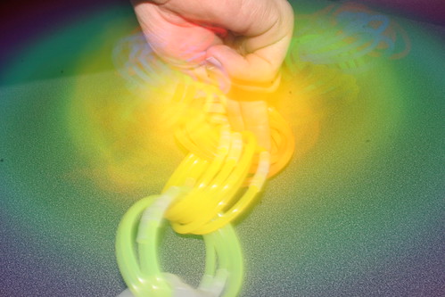
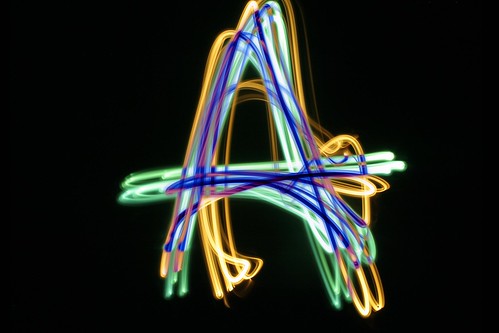
I originally began experimenting with the use of colour with the rockwell typeface to give my font a little more depth, however this didnt seem successful. By chance, I layered two different colours of 'organic' movement type in different colours to create a much better effect. After choosing the correct layer mode this is what I came up with. Combining a range of colours. Isn't it lovely?

Lighabet


Lighabet
Originally uploaded by Luke Hallam Photography

First final idea for a typeface overlaying a rockwell font. I chose it because of strong serifs and clear define of each edge to trace. Im happy with how it came out although the exploration of colour and a more organic movement was prefered in the crit, so I will continue with that and experiment.

Tuesday 10 March 2009

Shine a light

I invested in a few different light sources and combined with some filter samples I have to create some coloured lights. I especially like the letterforms in this sample and probably what I will continue in the line brief.

IMG_6749

Pro Flickr

My account has been upgraded, now expect many more photographs on there. I hope this'll encourage me to take more photos.. especially because I'm paying for it. :)

IMG_0600

Glow sticks.

IMG_6716
Little bit more experimentation with light and line, here with glow sticks. Again click to see a few more images, but strangely coming to the end of my monthly flickr limit.. yet only uploading 25 or so images.. rubbish!

Traffic.

IMG_6692
Photos experimenting with traffic lines and trails. Just as a starting point and another possible direction. Click the image for more photos.. hopefully.

BOOOOOOOM light drawings

Light drawings created by Cenci Goepel and Jens Warnecke from booooooom.com Just more examples of experimenting with line.