Thursday, 18 December 2008

Typogateaux


Bit of fun, cakes on the last day before christmas devised by amber, Mine is the bottom one, not great but it did taste really nice. People were put off by the bottle of green food colouring I used for each of the green cakes..
Sunday, 14 December 2008

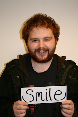
Smile!

 So yet again another blog update to do when ive left the blog alone for too long.. Well pretty chilled few weeks for the work in some cases, but the recent brief turned out quite good. 'What if?' was the title and we had to devise a problem from the previous research in the brief (research from a theme devised from 100 photographs taken) in a nut shell. Our problem in my group (Martyn Woolley, Sophie Robinson, Rebecca Liggins and myself) was that leeds isnt happy enough from all the research we did.
From this, and the questionnaires formed we tried to solve the problem directly from the answers 'what makes you smile?' answers included smiling from other people, comedy and other related answers. the solution was really only based around photographs I took with art direction.. they came out quite good. Check emmm-


look alright don't they? Going for more of a natural smile than something that may look forced.. and I think we did it well.


Sunday, 23 November 2008

Mailshots. What a brief..

After the annoyance of the previous impact poster brief where the brief was met but not allowed (not allowed black and white) I was kinda determined to make something out of the next brief.. and it was well good! mailshots, having to produce, 10 identical mailshots based on the previous work from the 'no news' briefs.. as mine was based around plastic bags and recycling. I lead off with that as a basis.. From the work ive previously done, I found that people on average use 300 plastic bags per year so that was a good starting point to go from. My original idea was to send old plastic bags in envelopes to people to encourage people to reuse them.. but you dont tend to see anybody re-using carrier bags unfortunately, because of how they look, and the designs placed upon them. Then i thought about making new bags to go inside envelopes for people to use..
But why couldn't the bag be the envelope? some sort of folding bag out of the net of the closed envelope.. based around an original net of a carrier bag and adjusting the dimensions, I formed (actually quite quickly) a net to fit within the bag.. It wasn't perfect but it worked. i guess all the best ideas are the simple ones that come quite easily. After adjusting the idea (as you'll see on the images) reducing the height on the top so it folds flatter, and making it from a single sheet of sugar paper.
After the idea, the name and branding came quite quickly 'Postbag' a bag from the post that you can re use.. My target audience was for students, so the the type, and potential imagery was all based around them. I think its time for some pictures now to actually show what im on about.

The closed article, looks like a normal envelope right? no need to apply many graphics to the outside, just to the address the same as the inside and just keep it normal everywhere else.
the graphics on the outside of the bag, screenprint'd that look really nice I have to admit, after the sugar paper, screen and colour it came to £1.60 for enough for 15 postbags, amazing! Definitely screenprintin' again for another brief, the results look really good. 
The front (and as it would for different editions for different target audiences) shows different items that students would usually buy (stereotypes, but it doesn't matter) in quite an organised form.
The left side shows typography that promotes the bag, encourages people to use it and recycle.
The right side has an address as the main logo for postbag 'concerning everyone, everywhere, US3 1NW' or 'use one now'

I got some really good feedback from the final crit, with only really the material used to highlight. As the research shows, purely to fullfill the brief, I used sugar paper but with more time, development, and money, the bag would of been produced with a canvas material used. Also would be colour, we were allowed 2 colours and stock, but if im honest, i didnt think about it too much on the time frame, just green to instantly give a 'recycled, natural feel.'


Wednesday, 12 November 2008

Super update.. or 'supdate' if you will..

Well.. time for a super update on the ol' blog. I have to admit my attempts recently have been a little thin on the ground, but not to worry, by the end of this post I should have pretty much everything up to date. Ok firstly Visual thinking the new rota'd time in on tuesday afternoon.. At first I thought it would be just time taken away from the rest of the course but its actually quite a good afternoon to work with paper in a raw form, something I haven't really worked with in the past. So, heres the pictures.. We had to visualise different words and phrases within paper shapes and a fixed amount of colours.

'Bright bounce'
'Simple bear'
'Harsh Penguin'
'Tall'
(From L-R) 'Line', 'squash', 'comfortable', 'lost', 'snap', 'dance'

NEXT. Plastic recycling is booming in the UK. quite an interesting brief to form three high impact posters based around the quote from the news paper.. from the work we had done the monday to do with combining image and type, it worked well as a basis for ideas to be produced.. There was limitations with the outcomes which i'll moan about in a minute, grr. Anyway, ideas -
Lots of little ideas on a5 sheets to be a basis of the posters.

 Open, closed questions. Fact and opinions

Symbols created.


Selection of development for the posters.


NOW. We weren't allowed to use black and white in our designs which is fair enough.. but the annoying thing is I actually havent, but still caught up on it. The bags are blue, the text was green and the 'maths' poster the stock was allowed according to Amber but then turns out not to be. Not impressed. Although, that aside, probably my favourite pieces so far on the course. It was good to think that these were created with illustrator, a program I would usually be scared of using, but they came out alright yes? 

Mailshots is the new brief at the moment we are conquering, based around the recycling briefs i have had previously. To produce a mailshot to be sent to relevant people, I have some goooood ideas, but nothing really to post as yet, so you'll have to hang on for that. x

Tuesday, 28 October 2008

What is yellow?

I figured I may aswell update my blog.. even though this is currently offline on word.. I have an hour to kill on the train when I go see my friend Anna Sangha in Lincoln at Uni, so I figured I’d do the draft version now. Her blog (even though she probably hasn’t updated it in ages) its www.annacanvas.blogspot.com

Anyway.. the recent brief we had was ‘What is yellow?’ Since the beginning of the course, we had a pack of materials and a few random items.. one of my random items was a yellow toothpaste and was later used for numerous briefs and tasks since then (the colour theory work, placing colours into groups) For the new brief, from the work we had on that chosen colour, we had to answer the question, what is yellow in 10 resolutions A5 squared (150mm x 150mm)

I began by describing words, objects, context and phrases all to do with yellow, as shown by Fred Bates breaking down the brief to truly understand what was being asked for. It was a really good way of working, giving you the ability of putting down your ideas fluidly about such a vast subject, from there you can make some creative links (see my a2 sheet below..)

From there, as we are told time and time again to be visual with our ideas, I drew some simple ideas and created a few concepts for what can be achieved  (7 in total I think) Although illustration isn’t my strong point, I really wanted to create something bold and fun with some doodles.. My drawing style of characters is very basic shapes and smiles formed which I though would work really well witha brief like this. My original concept was going to be ‘Yellow in situation’ creating 10 resolutions of yellow characters made out of yellow objects in yellow situations. I found our while researching in groups that in certain areas a football is yellow when played in winter, so to add more yellow, I featured players made from yellow rubber gloves to make the image a little more fun J from there I created a few more examples and progressed with the production.

Originally when experimenting the concept I really wanted to create the characters as vector formed graphics, bold colours, clean lines and subtle shading and gradients.. (similar to the work of the Gavin Strange –  www.jam-factory.com ) until I truly realised my skills on illustrator.. terrible. Instead, I went for a more low-tech approach of recreating my sketches in greater detail and rendering with good marker pens instead.. the results weren’t as good as I wanted, but Iam pleased with some of the outcomes. Maybe something to investigate into with some more induction sessions and practice with illustrator in my own time.

Just to keep on the right track, I booked myself into a ‘student surgery sessions’ (who writes this stuff? ..really) on the Thursday and had some more guidance with Jo. It turned out really useful and put me more in a direction with my work, answering the brief a little better. The original concept although good, didn’t really answer what was yellow, just showed yellow.. so back to the drawing board so to speak the concept changed to ‘Yellow is visability’ It didn’t really take more modification, I was more placing the imagery in the correct order and emphasising the look of visibility. The resolutions now included, traffic lights, vehicle recovery, bouncers at a nightclub, a nightlight and a taxi.

Below are the finished articles, placed in order and on the board for the harsh views from the interim crit from Friday afternoon. In a crude way of ‘judging’ work that had been created the work was removed from the wall in order and leaving the most successful piece on the wall. Apparently from the work, the links weren’t as clear as others, but although I think they were, and some feedback I got from friends. I think it was probably me spending all week with the work that made it obvious to me, quite a bad habit to be in..

*image coming soon*

Sunday, 26 October 2008

Chuck Anderson


Chuck Anderson born 1985 from Grand Rapids, MI creates amazing light effects as an overlay for photography. It looks brilliant! He's done work for everyone from adidas to threadless, to fall out boy to mcdonalds, to D+G to sony and microsoft.. to name a few. Full listings and more amazing pieces on his website www.nopattern.com  The ones above, are my favourites and really inspirational to look at. Something to aim for? and only 23!

Wednesday, 22 October 2008

I need to dedicate more time...

...to photography. I have a really nice camera, that I just dont use as much as I should to its full potential. Maybe dedicate an evening/afternoon to purely photography to get a larger library and improve techniques. Maybe involve the 'randomiser' for themes? 

Monday, 20 October 2008

New brief... what is yellow?

A brilliant brief! im actually really excited about it.. no pictures just yet, but the ideas im generating I think could actually be quite good. A proper blog tomorrow, i just felt I had to say something today. Its not the kind of thing i'd usually do, but taken an interest recently for.

You'll see. Not that anyone actually reads this :S

Insaneee.

Just wait for it to start, a few minutes in and watch the longboard footage. Just found it while cruisin blogs.


Adam Kimmel presents: Claremont HD from adam kimmel on Vimeo.

tony Cragg


Caught my eye when visiting the Leeds art Gallery, and its relation to the colour work we have been doing. Unfortunately from what ive researched, this is the only piece of its kind created by Cragg, his usual work is sculpture, and sculpted drawings.

Fontastic.. and the shortest day.

Hello, thursday was the day we revealed our fonts to each other, discuss our ideas and see what can be improved.. Below is my font, created by Emma Price which i really like. It displays mature, travelled, detailed and organized qualities about me really well (which were the words we agreed on) and it looks really professional. Might make it into an actual font. Oh! that reminds me, recommended by adam a website to create your own fonts.. fontstruct Ive only made one so far, but i will make more soon and keep experimenting with it.


We also created name badges for each other displaying our font we made for the other person. I made the badge a little bit more personal by having a nickname and including her childhood imaginary friends name on the badge, a nice little touch.


Thursday afternoon, I attended a typeset induction and learnt how to set type.. it only took us 2 1/2 hours each to make a sentence :S it came out really nice though.


You take individual letters from massive trays of characters to form words and sentences. Quite a relaxing process, but i wouldnt want to do it for an entire newspaper like it used to be done.


Friday, which was probably the easiest uni day so far was our screenprint induction that in total only took about 2 hours in the day to complete, which was nice! Using a monoprint made, we photocopied it twice, and manipulated one of them to create two layers of a print to be screen'd above the original magenta print and below the manipulated photocopy.


Below, adam at work printing our designs, all placed on one large screen to save space and time. Which each took it in turns for all the prints to be produced.


Tuesday, 14 October 2008

After hours.

Just coming up to 18.00 and theres people still  here in the studio. Im actually in amazement that people are here so early in the course for such a short project.. you wouldn't find many people at NCN staying later, infact the studios weren't even frikkin open after 5pm some nights. Its good, sat listening to music, talking and each working towards the deadline on thursday. Its a nice place to be. At the moment we're creating fonts for each other based on information we've collected. I have Emma Price, check her blog here.
Ive been mixing up some fonts to create a hybrid the would suit her, some of the words collected were fun, traditional and polite.. which hopefully ive sumed up quite well. Here's the development im working on.. AS WE SPEAK..

Rockin the lightbox (can't wait to get mine back up in leeds) adding serifs to pointy font to help the fun font a more traditional look.. see what ive done there?

The work space! probably the most space ive had while im here, a plus for staying late so you dont have to share with 52 other people :S i wish we had more table space.

Couple of sample fonts on the new 'book pro. but only on Word :( hopefully have some more software soon.

Testing with pencils on tracing paper, attempting to do it as neat as possible.. its not working. 
And the studio! looks good with this few people in it. Well back to work, i might add to today later if i progress any further. x