I want to keep the interior quite typographical, a couple of ideas to draw attention to the main and key points and facts Ive found out, with related facts selected and placed next to these main pieces. Just a piece of development really.
I like the basic simplicity of your idea, the visuals work really well and the tag lines are very simple but effective. Not too keen on the font, but thats just me. Its a little... tame? does that make sense? but i like it. Lookin forward to seeing the others you do.
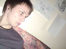
This is a blog by me, Luke Hallam. Displaying thoughts, inspirations, work and everything in between. Just a branch into what im like creatively using Graphic design and photography. I hope you enjoy, tell me what you think.
20, living in Leeds and studying Graphic Design at LCAD.
Likes- Spraypaint, photography, 50's furniture design and cheesecake.
Dislikes- Bad weather, Word clip art, Pretentious people and morris dancers

 I want to keep the interior quite typographical, a couple of ideas to draw attention to the main and key points and facts Ive found out, with related facts selected and placed next to these main pieces. Just a piece of development really.

1 comment:
I like the basic simplicity of your idea, the visuals work really well and the tag lines are very simple but effective. Not too keen on the font, but thats just me. Its a little... tame? does that make sense? but i like it. Lookin forward to seeing the others you do.
Post a Comment